Clinical trial branding plays a critical role in whether patients engage with a study, yet it’s still often underestimated.
Research shows that unclear communication and low perceived relevance are among the leading barriers to clinical trial participation, directly affecting recruitment and retention. Studies also demonstrate that simplified, patient-centered materials significantly improve comprehension and willingness to participate, while complex or poorly structured communication increases dropout and disengagement.
In other words, how a study is presented visually and emotionally is not secondary, it shapes first impressions, trust, and ultimately, participation.
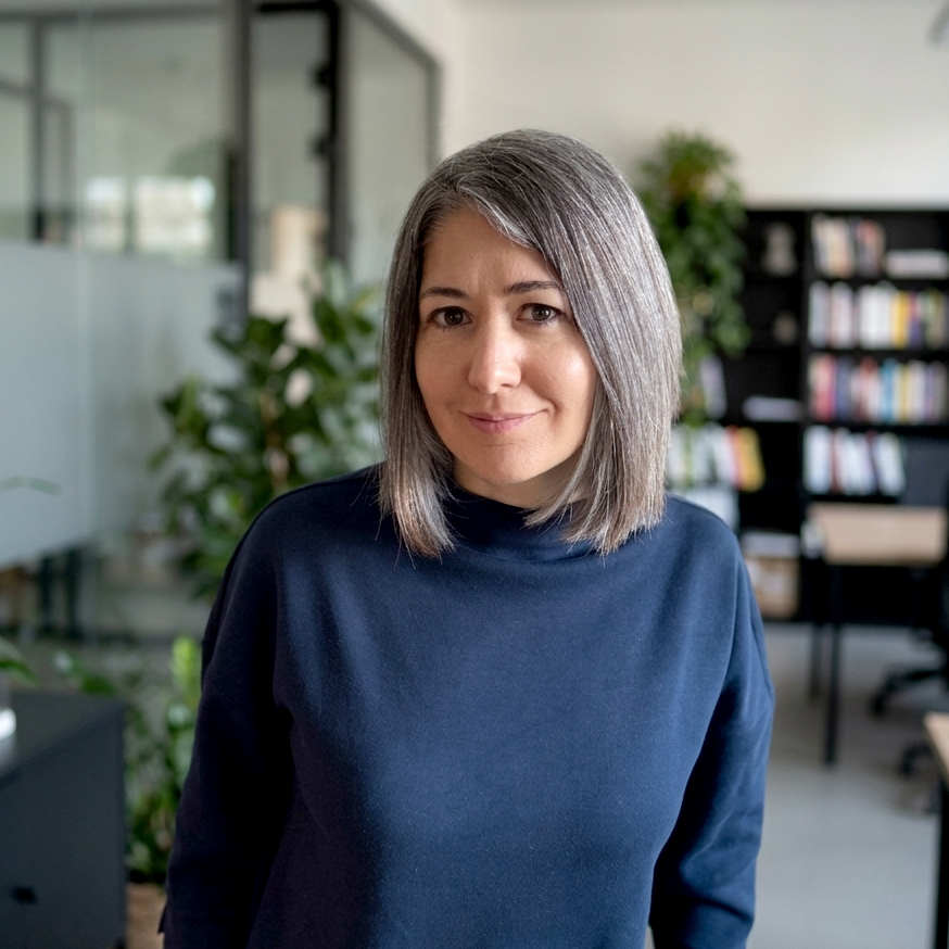
This Q&A with Fanni Hoffmann, Creative Director at Clariness and expert in all-things, design, visuals, and clinical trial study identities, addresses some of the most common questions around creative strategy and branding in patient-facing materials. It explores how these elements can transform clinical trial communication into something patients understand, trust, and act on.
1. Where do sponsors misunderstand patients the most?
Fanni: It’s less about a single misunderstanding and more about the challenge of finding common ground on a deeply personal topic. Health is one of the most important topics in human life; to communicate effectively, we need to understand the emotional state of each patient, not just in one region but across the globe.
In my experience, the biggest gap occurs when patients are treated as numbers in a recruitment quota rather than as partners in the process. This often shows up in how information is presented. For example, patients may be given dense materials filled with medical jargon or complex visit schedules presented as tables full of dates and symbols. While technically accurate, these formats can feel overwhelming and difficult to interpret.
By contrast, simplifying language and using clear, visual explanations – such as a step-by-step journey maps or illustrated timelines – can make the study feel more understandable and approachable. Seamless retention is achieved through consistent, effective communication touchpoints. By using well-structured and thoughtfully designed creative materials, we can simplify the study journey, reduce participant burden, and support long-term partnerships.
2. Is AI going to take over creative work in clinical trials?
Fanni: In short: No. AI is a powerful engine for efficiency, and of course we are already leveraging it at Clariness, however it unfortunately lacks two essentials for clinical trial branding: empathy and originality. We are already seeing a trend of generic AI aesthetics where everything looks the same because it lacks individuality and recognizable character. Research suggests that AI can support creativity, but its output often lacks diversity, relying on it alone can lead to repetitive ideas and limit creative exploration. In clinical trials, where we need to connect with patients on a human level, AI can’t replace the creative professional who understands the human aspects of the patient’s journey.
People recognize AI-generated artworks, and if a brand doesn’t even bother to personally speak to its target audience through authentic and original design, it creates distrust.
At Clariness, we use AI to accelerate technical tasks, boosting design production speed by 40-60%. From intelligent resizing and background removal to rapid concept testing and localization, it helps streamline execution and ensure consistency. But while AI enhances efficiency, empathetic ideation remains human. We use technology to expand our reach, never to replace the personal connection that builds trust.
3. Where does AI actually help with clinical trial branding?
Fanni: While AI isn’t the creator, it is an incredibly powerful accelerator and helps our work in many ways:
- Technical precision and speed: On a practical level, AI streamlines the ‘heavy lifting’ of design. It enables rapid image processing and automation of repetitive manual tasks that used to take hours.
- Bridging the knowledge gap: Perhaps its most unique contribution is how it manages the information flow between science and art. Creative professionals are rarely medical experts and yet still need to quickly understand complex indications and protocols to design effectively. Our designers of course deepen their medical understanding while working in this field and liaise with our Medical team throughout the process, however it is somewhat of a moving target considering Clariness has covered 400+ indications in our lifetime. AI helps bridge that gap by accelerating how designers learn about different indications, turning complex information into clear, relevant insights that inform better creative decisions. It allows teams to build a more accurate understanding of a study’s context, identify potential inconsistencies in visuals, and adapt designs to the specific characteristics of each condition, significantly reducing the time it takes to get up to speed.
- Accessibility & inclusivity: In clinical trials, branding isn’t just about looking good; it’s about being understandable. AI is a gamechanger for adapting study identities to diverse populations.

4. What does ‘bad’ clinical trial communication look like?
Fanni: Bad communication is simply communication that forgets who you are talking to and what interests them. While we generally try to avoid “brutal reality” in order to create a sense of comfort and understanding, even that is not a golden rule. One of the biggest mistakes we can make is to let personal preferences, whether those of the designer or the sponsor, guide the direction.
I always advocate for testing concepts with the target population. I once had the opportunity to test three distinct creative concepts with patients before choosing a direction and the learnings showed how even small creatives choices can either build trust or create distance:
- Patients rejected ‘sick’ or passive visuals and instead related to active, everyday life moments tied to their personal goals and milestones.
- Patients expected immediate clarity on the condition and study purpose and disengaged quickly when messaging felt vague or overly complex.
- Key elements like the study name and core message needed to be instantly visible and directly connected to the main visual.
- Bright, high contrast colors such as reds, yellows, and oranges were perceived as more engaging than muted, clinical palettes.
- Patients responded best to visuals that reflected their specific cultural and lived experiences rather than generic notions of diversity.
While time and budget don’t always allow for this, conducting TA-specific (Therapeutic Area) patient research from time to time is the only way to move from assumptions to real understanding (revealing which colors, imagery, visuals styles, terminology, tone of voice, content formats, trust signals, and study messages truly resonate with patients).When we involve them, treat them as partners, we build a community they want to belong to.
5. What makes a strong study identity vs a forgettable one?
Fanni: The difference between a strong identity and a forgettable one is distinction. A forgettable identity plays it ‘safe’, relying on medical clichés that blend into the background. A strong identity, however, has the courage to stand out.
In my view, a strong study identity is built on three pillars:
- Narrative: It tells one clear story. Whether that story is about strength, clarity, or a new chapter, every study identity element must support that single theme.
- Emotional resonance: A forgettable brand is cold and clinical; a strong brand is emotional. It acknowledges the patient’s lifestyle and challenges.
- Courage: A study identity that is brave enough to be different, sends a powerful message to the patient: “This study is different. This team is innovative.”
6. What role does trust play on a study website and how do you design for it?
Fanni: “Drop-out rates” (i.e. people leaving the site immediately) are often directly related to a lack of trust or interest. Patients are naturally skeptical of online medical information, and our surveys show that a high percentage of them trust their doctors when it comes to health. Design is the tool we use to break down this skepticism, building trust on your study website.
| Pillar of trust | The core objective | Design implementation |
| Professionalism (The “First 5 Sec” rule) | Create an immediate sense of legitimacy and high-quality standards. | Use a modern, clean UI with high-resolution, authentic imagery (for all devices). Avoid dated “medical” tropes and cluttered layouts. |
| Transparency (Clarity of information) | Reduce patient anxiety by removing the “mystery” of the study process. | Use plain-language FAQs, visual “How it works” infographics, progress bars, and built-in feedback mechanism. |
| Authority (Verification & credibility) | Prove that the study is ethically sound and backed by reputable institutions. | Feature the logos of the sponsoring institution, partner hospitals, and IRBs (Institutional Review Boards) if possible. Involve and partner with advocacy groups. Add patient voice (testimonials). |
| Cultural resonance (Localization) | Ensure the study feels “native” and respectful of the local participant’s culture and language. | Adapt imagery, idioms, and date/unit formats to local standards. Use native-speaker proofreading to ensure the tone is authentic. |
7. How do visuals influence whether a patient decides to participate in a clinical study?
Fanni: Visuals act as the “silent recruiter.” Long before a patient reads the informed consent form, they have already made a subconscious decision about the study’s safety and relevance based on what they hear from an HCP or read in a brochure, how they are treated during the informational phase and of course based on what they see.
In clinical trials, visuals function as an emotional and cognitive bridge. By providing a clear, empathetic and professional visual environment, we help remove the psychological barriers that prevent the patient from saying ‘yes’.
8. Should a clinical trial feel like a ‘brand’? Or is that the wrong approach?
Fanni: This is a common question in our industry. There is a fear that branding a study can feel too much like advertising. But the truth is, a study needs to feel like a brand, not to sell it, but to make it more human.
If you don’t intentionally create a brand, your study still has an identity, but it just happens to be cold and clinical. Without a brand, patients are left with a collection of dry documents and generic, emotionless flyers. This creates a visual void that leads to anxiety, uncertainty, and confusion.
9. What should sponsors rethink today?
Fanni: Based on the current landscape of clinical research, I think, sponsors need to move away from viewing creatives and visual communication as a nice-to-have and start seeing them as strategic assets. The industry is shifting toward more patient-centric, decentralized, and diverse models, which requires a fundamental rethink of how a study presents itself.
Here are three key areas where sponsors should rethink their approach today:
- Rethink patient focus as a design requirement
- Rethink courage to stand out
- Rethink digital trust

10. What’s the one thing sponsors think works – but actually doesn’t?
Fanni: There are no universal rules that apply to all cases, every study has a different population and barriers, but if I had to name one thing, it would be the belief that “More information leads to more trust.”
Sponsors often think that by providing every possible detail, they are being transparent and helpful. In reality, for a patient, too much information and materials that are too long (e.g. 8-minute videos, complex 10-page websites, or 46-page guides) can make the study overwhelming and difficult to understand.
What really works is not more information, but better structured and better distributed information and constant two-way communication. Trust is not built by the amount of data provided, but by how easily the patient can find answers to the most important, fundamental questions for them.
11. What are your two biggest learnings from your ‘Creative’ journey at Clariness?
Fanni: Looking back, the most important thing I learned is that creative work in clinical research is not a decorative layer added at the end; it is a communication strategy to bridge the gap between complex medical requirements and participants.
If I had to distill my experience into two core learnings, the first thing would be the weight of responsible design. Our work carries a great deal of ethical responsibility. In clinical trials, the stakes are much higher for creative design. Understanding that my work has a direct impact on the safety, trust, and clarity of a participant’s journey has given my creative process a deeper sense of purpose and value.
The second learning is that a standard perspective does not exist in a global trial. To succeed, you must constantly adapt your approach. I’ve learned to design through a multi-dimensional filter (cultural, educational, generational, indicational). Learning to juggle these perspectives simultaneously is what differentiates a generic creative from a clinical trial specialist.
A closing note
As Fanni’s insights highlight, clinical trial branding is not just a finishing touch, it’s a foundation. A difference between a patient saying ‘yes’ or ‘no’ often comes down to whether they felt seen, understood, and are able to trust what they’re engaging with. For sponsors, the question is no longer whether creative strategy matters, but whether it’s prioritized early enough to make an impact.
With over 20 years of experience, Clariness has delivered 48,000+ creative assets supporting 1,300+ study sites in 40+ countries globally. That scale of expertise is now available through Clariness’ Enterprise Trial Solutions – Creative Labs – a single, streamlined solution built to accelerate patient recruitment from first impression to final enrollment.
Save up to 30% on time and costs with Creative Labs. Ready to rethink how your study communicates?