Clinical trial branding is essential for improving patient engagement and it starts with a strong study identity. A study identity forms the visual and emotional foundation of a clinical trial, shaping how it is perceived by patients, caregivers, and healthcare professionals.
Behind every study are patients making difficult decisions, navigating uncertainty, and making personal sacrifices. A strong study identity reflects these realities, combining storytelling, imagery, illustration, and data to create designs that patients can understand and trust. It transforms a clinical trial from a technical document into a human experience, helping improve patient recruitment, engagement and retention.
In this blog, we’ll explore what study identities are, and why they matter in clinical trials.
What is a study identity in clinical trials?
The study identity is the “personality” and the “face” of a clinical trial. While the protocol defines the science of the study, the identity defines the experience. It is the collection of visual elements that represent the study to patients, caregivers, sites, and HCPs.
Study identity acts as a bridge between a complex medical document and a human participant. It takes abstract scientific concepts and translates them into something approachable and understandable. When a study has a strong identity, it stops being “Protocol 123-ABC” and becomes “The Journey.”
It also ensures consistency with messaging and visuals across materials and provides an emotional “personality” and an overarching story to the clinical trial branding.
Why are clinical trial study identities essential for patient recruitment?
Study identities are essential for patient recruitment and retention because they make studies more understandable, trustworthy, and relatable to patients. A strong study identity tells a consistent story across all touchpoints, helping patients quickly recognize and feel familiar with a study in a crowded clinical landscape.
By combining clear messaging with thoughtful design, study identities reduce complexity and build trust – two key factors in a patient’s decision to participate. They transform a clinical trial from an abstract protocol into a recognizable and approachable experience, increasing engagement, improving recall, and ultimately supporting stronger recruitment and retention.
What elements make up a strong clinical trial study identity?
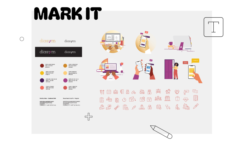
A study identity always includes a creative concept with a logo, color scheme that fits with the study indication, appropriate typography, and an image or illustration library that appropriately resonates with the patient profile and will be used as the source for visuals throughout all materials.
What is the goal of a logo in study identities?
The primary goal of a study logo is to create recognition and differentiation through campaign branding, making it easy to identify and distinguish from other clinical studies. It can symbolically reflect the meaning or purpose of the study. There is also an element of trust it evokes, with a professional and consistent logo increasing the credibility of the trial for patient recruitment and retention.

Image vs. illustrations in clinical trials: Which works best for patient engagement?
Images feature real people doing activities, consulting medical professionals, or being comforted by loved ones. Illustrations are created by design teams that can show human figures, landscapes, or any type of character that a patient would resonate with. There are certain scenarios where one is preferred over the other, such as illustrations for pediatric trials. It is a sensitive situation when recruiting for pediatric trials, and illustrations feel less intimidating and relatable than real-life visuals. They can also be adapted to different ages, conditions, and cultural contexts. Bright and playful visuals can be more appealing and less clinical as well, leading to better engagement and recruitment.
How is a clinical trial study identity created?
Naomi Mira Pallagi, Graphic Designer at Clariness explains:
“We begin by reviewing the study brief and protocol in detail ahead of the kick-off meeting, noting any questions or clarification needed. During the kick-off with sponsors, we capture additional insights and requirements to ensure full alignment.
All inputs, including the patient persona, are then consolidated into a creative framework. At this stage, we also conduct market research to understand current trends and identify approaches to avoid. Once we have a clear direction, we develop a mood board to visually communicate our concept to the wider design team and ensure differentiation between ideas.
From there, I typically start by designing the logo, followed by the key visual. In the final stages, I refine the color palette, define the iconography and visual style, and curate suitable imagery from the image library, ensuring all elements are cohesive and aligned with the study identity”
What is a clinical trial briefing and why does it matter for branding?
A briefing is a document filled out by the sponsor to help the designers begin their creative process. It is an essential first step to the study design creation because it highlights the patient profile, states the study’s purpose and the target audience (patients, caregivers, doctors), clearly defines the key messages and tone they prefer, and asserts how they want the patient to feel when seeing their creative materials – supported, empowered, and respected. All of these elements are essential to take into account when designers start creating different options to be used for clinical trial branding.
Briefing can also help designers approach clinical trial branding with a more emotional or more scientific approach. The study team can guide their own vision by clarifying which direction is more appropriate for each particular study. For instance, if there is a study concerning visual impairment, should the visuals represent images of vision-impaired people doing daily activities (emotional) or a more technical, yet still artistic, visual of an eye. Both these concepts are viable but one may resonate better depending on patient profiles and trial.
How can sponsors give better feedback on clinical trial study identities?
When discussing study identity, it is vital to get constructive feedback from the study team. Their input is key to ensuring that the voice and focus of the study connect with the patient population. While we handle the aesthetics, the study team holds the expertise on the patient population, the indication, and the study’s “soul.”
When giving feedback on concepts, it’s not just about “picking a favorite color,” but about the ability to empathize and evaluate what we see from the perspective of the target audience.
| Feature | Constructive feedback “what” and “why” | Non-constructive feedback “I just don’t like it” |
| Specific | “The red feels too much like an emergency; can we try something more calming?” | “I don’t like this color.” |
| Actionable | “The font is hard to read against the busy background.” | “This looks messy.” |
| Goal-Oriented | “Our patients are elderly; this graphic element feels a bit too childish.” | “Make it ‘pop’ more.” |
| Objective | “This logo might be confused with a healthcare brand.” | “It looks weird.” |
The feedback process for a study’s identity happens on two levels: feedback on each piece, the logo, the colors, the typography, and the graphics, to ensure they are perfect individually. However, we must also evaluate how they function as a unified ecosystem. All these elements must harmonize and tell a single story. A clinical, high-tech logo might clash with soft, emotional visual, so it is vital that the technical and emotional aspects are in total alignment.
What to avoid when giving design feedback on a study identity
- Multiple personal opinions: Trying to merge five different opinions into one “Frankenstein” study identity usually results in disharmony. Align on the objective and then let the designers find their way.
- Subjective bias: Avoid rejecting elements based on personal preference (e.g. disliking a color). Instead, consider, “Will it resonate with the patient?”
- Vague adjectives: Terms like “modern” or “professional” mean different things to different people. Use reference images or clearly explain what feels off and why.
- Focusing on the ‘wrong’ details: Don’t get stuck on minor elements (placeholder images), when the purpose of the discussion is the overall concept.
A surprising lesson from real sponsor feedback
One of the more memorable pieces of feedback we received was the request to avoid using a specific animal-related imagery or graphics. The client felt that the particular animal’s sound could resemble laughter, which might come across as insensitive or as if we are “laughing” at patients. Initially, we associated this animal with positive qualities, as they are often seen as friendly symbols and are even considered a sign of good luck in some cultures. However, we fully understand and respect the client’s perspective. As a result, we decided not to include this animal or related elements in the study identity.
A final Thought
Clinical trials may begin with science, but their success depends on how well they connect with patients. A strong clinical trial study identity brings clarity, consistency, and trust to that connection, helping patients feel understood, supported, and confident in their decision to participate.
From the initial briefing to the final design, every element of clinical trial branding plays a role in shaping that experience. When done well, it transforms a complex protocol into something human and accessible, ultimately improving patient recruitment, engagement, and retention.
As clinical trials become more competitive, investing in thoughtful, patient-centered study identities is no longer optional, it’s essential.
Let’s make your study stand out.
Author: Jackie Janssen, Senior Medical Copywriter/Content Creator Clinical Trials | Post Date: 05.05.2026